CareLink
Self-care Hypertension Management


My Role: UX Designer
Research, UX Design, Prototyping, Visual Design, Usability Testing
Duration: 7 months starting from Sep 2025; Seattle
Tools: Figma, Adobe Illustrator, Adobe Photoshop
Sponsor: T-Mobile; mentored by Candice Boyd (Senior Manager)
Team: Chenxi (Designer), Liliana (PM), Qiana (Research); mentored by Linda Wagner (Director of UW GIX)
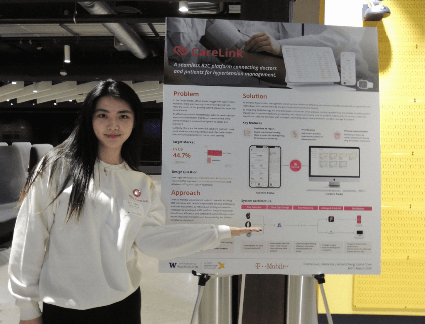
CareLink is a B2C hypertension management platform that improves long-term care and bridges patients and doctors through connected digital experiences. It includes a mobile app for patients and a desktop dashboard for doctors, enabling real-time health tracking, AI-powered health insights, and direct doctor-patient communication.
As the UX Designer on this cross-functional project with T-Mobile and the University of Washington, I led the end-to-end design for the patient-facing mobile app, working closely with PMs, engineers, and researchers. Our goal was to empower patients to understand their blood pressure trends, receive personalized AI guidance, stay motivated through health goals, and communicate directly with doctors. This case study will walks through the design process behind that mobile experience.


We focus on Mobile App in this case study
My Role: UX Designer
Research, UX Design, Prototyping, Visual Design, Usability Testing
Duration: 7 months starting from Sep 2025; Seattle
Tools: Figma, Adobe Illustrator, Adobe Photoshop
Sponsor: T-Mobile; mentored by Candice Boyd (Senior Manager)
Team: Chenxi (Designer), Liliana (PM), Qiana (Research); mentored by Linda Wagner (Director of UW GIX)
CareLink is a B2C hypertension management platform that improves long-term care and bridges patients and doctors through connected digital experiences. It includes a mobile app for patients and a desktop dashboard for doctors, enabling real-time health tracking, AI-powered health insights, and direct doctor-patient communication.
As the UX Designer on this cross-functional project with T-Mobile and the University of Washington, I led the end-to-end design for the patient-facing mobile app, working closely with PMs, engineers, and researchers. Our goal was to empower patients to understand their blood pressure trends, receive personalized AI guidance, stay motivated through health goals, and communicate directly with doctors. This case study will walks through the design process behind that mobile experience.
Using interactive prototype for testing

Using paper prototype for testing
Evaluate the mid-fidelity prototypes
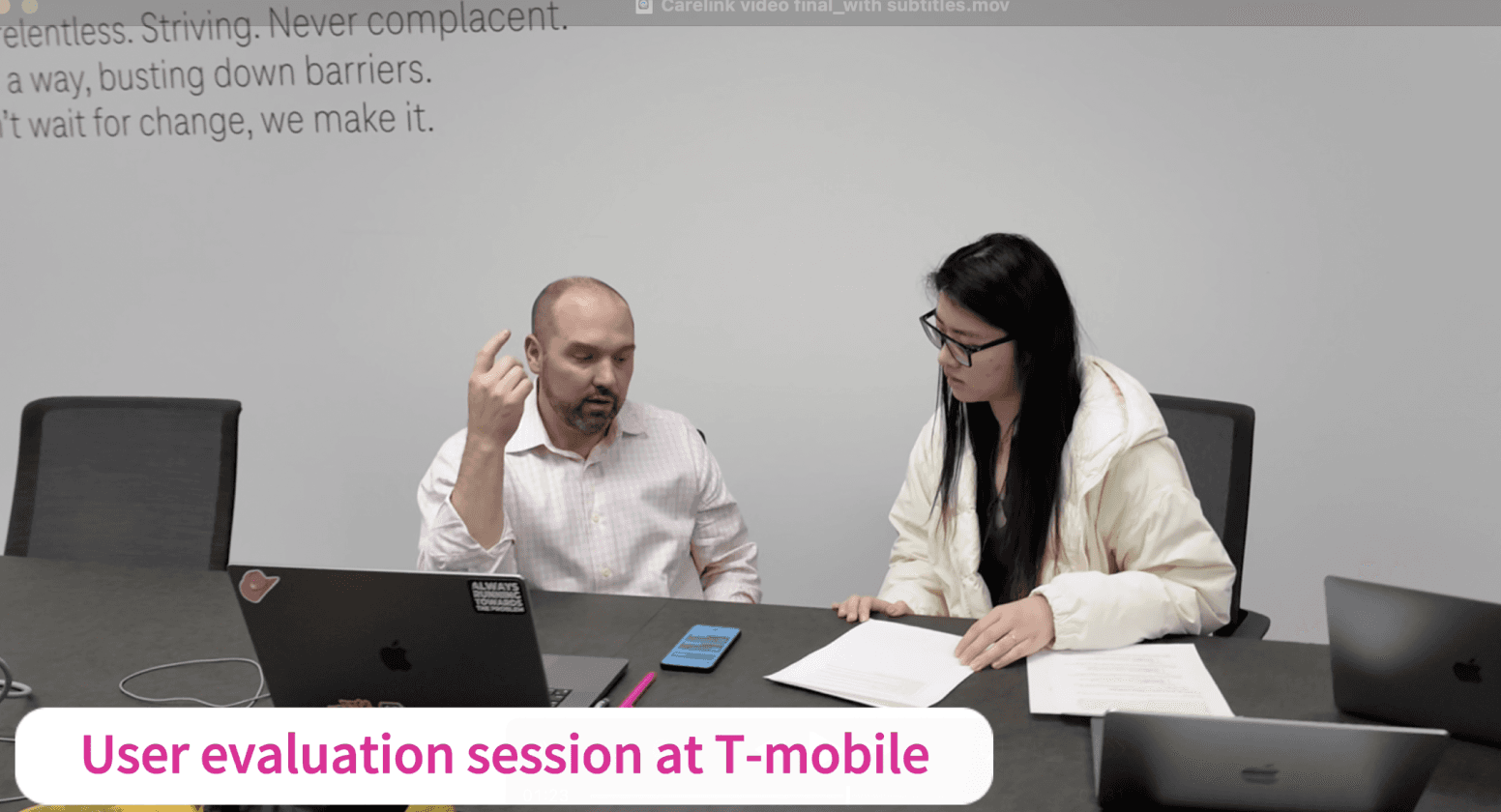
To validate our mid-fidelity prototypes, we conducted user interviews with hypertension patients aged 20–70. Sessions were held remotely, with each lasting 30–45 minutes. We observed how users interacted with key features such as BP tracking, AI diagnosis, and personal goal setting.
Our goals for the testing were to:
Evaluate clarity of health data on the dashboard and BP trend pages.
Test comprehension of symptom input and AI-generated feedback.
Measure engagement with personal goals and achievement features.
Assess ease of navigation across appointments, chat, and goal settings.
Identify accessibility issues in text, color contrast, and layout.
We narrowed down on potential ideas and started prototyping based on the flow identified in the wireframings. We created mid-fidelity prototypes and moved on to evaluate on that.
Usability Testing
Insight 1:
Patients found the interface cluttered and AI tips hard to read
Evidence: During user testing, elderly participants struggled with small font sizes and uneven spacing across the dashboard. Several mentioned that the interface felt “cluttered” and that “important button like AI Diagnosis were easy to miss.” Also, the overall structure lacked visual rhythm.
Improvement: Improve visual hierarchy and accessibility
We refined the layout by increasing font size for key metrics, standardizing component spacing, and reorganizing sections for clearer grouping. The AI Diagnosis button were redesigned with emoji cues, and simplified copy to improve scannability and readability.
Before

After
After

Before
Insight 2:
Patients found the page disconnected from the overall UI and the chart hard to read.
Evidence: Users noted that the white background of BP Trending screen felt inconsistent from the dashboard, and the chart lacked enough visual contrast.
Improvement: Improve visual consistency and chart clarity
We unified the background color to match the main app theme. The chart was redesigned with enhanced spacing, clearer bar alignment, and stronger contrast to make data more scannable and visually cohesive.

Before
After
Insight 3:
Patients felt result display confusing and diagnosis input unclear
Evidence: Users found the top circular bar showing past results (e.g., "Mid risk") before the user submitted new inputs is confused, users mistook it for the outcome of their current input. Also, the checklist too text-heavy and unclear, making it hard to engage with.
Improvement: Clarify patient flow and improve visual engagement
We removed the default display of past diagnosis results to avoid misinterpretation and now only show results after the user runs a new diagnosis. We also redesigned the input section with icons and color cues to make it feel more interactive, improving overall clarity and visual appeal.
Before

After
Insight 4:
Patients said the goal progress vague and wanted more personalized trackings.
Evidence: Patients were confused by the overall progress bar and not sure what the goal was. They asked whether they could view or edit specific goals like “no smoking” or “daily measurement.”
Improvement: Clearer goal tracking and visual breakdown
We replaced the single ring with detailed progress cards for each goal, including featuring icons, durations, and circular progress bars, to make achievements more scannable and motivating.
Before

After
Insight 5:
Patients felt appointments should come first and UI lacked consistency
Evidence: Patients said that upcoming appointments were more important than finding new doctors, but were placed lower. The yellow gradient cards also felt visually inconsistent with the rest of the app. They also found the reschedule button too prominent and missed a quick waty to message doctors.
Improvement: Reorder hierarchy and unify visual style
We moved appointments to the top for better prioritization, added a “Send Message” button for quick communication, and redesigned the layout using consistent background color and button styles for a cleaner experience.

Senior Living Center Field Study

Medical Experts Interview
Key Features
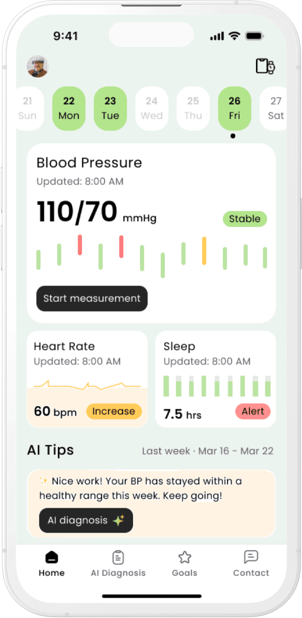
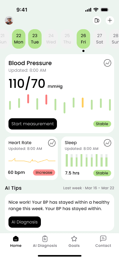
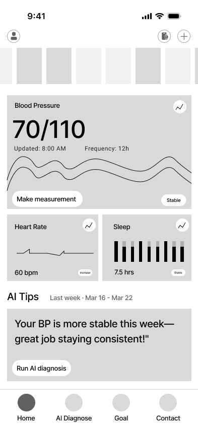
BP Tracking & Visualization
Automatically track blood pressure with synced wearable devices, visualizing trends with color-coded, easy-to-read charts.
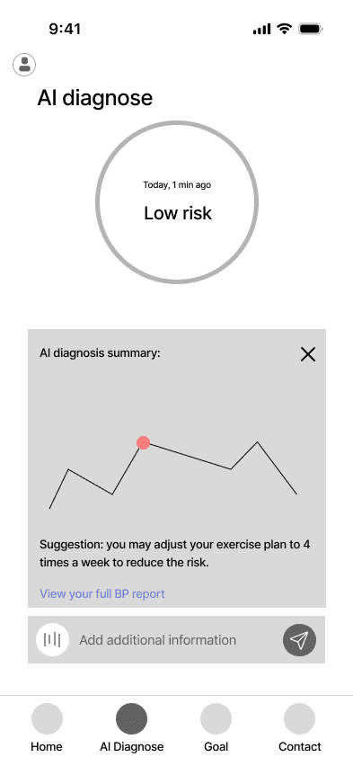
AI BP Diagnosis
Users can get instant, conversational insights from AI for their BP data, explaining what’s changed, why, and whether to contact a doctor.
Personal Goals & Motivations
Users can customize health goals, track BP and daily habits, and earn motivating badges to encourage long-term self-care.

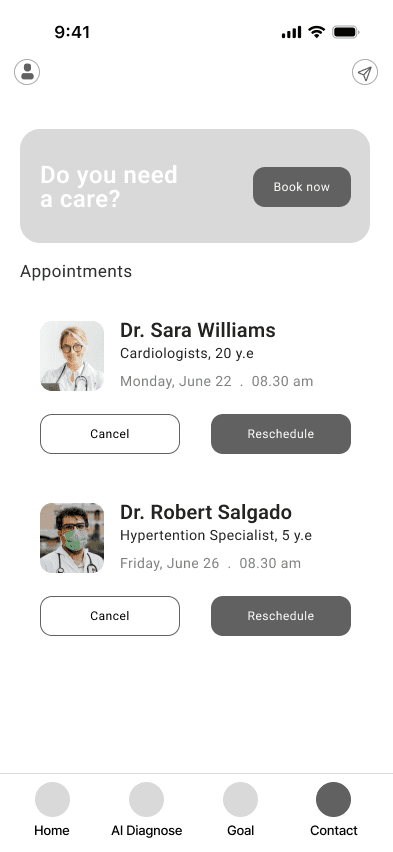
Doctor Communication Hub
CareLink AI generates shareable BP reports that can be attached with appointment booking or chatting with doctors.
After identifying four core pain points through user interviews, we mapped out the full patient journey. To address these needs, we prioritized key features with the information architecture: BP Tracking, BP Visualization, AI Diagnosis, Goal Achievements and Doctor Communication.
Ideation

Started from Sketches

Brainstorm Session at T-Mobile 5G Hub
We explored different solutions through sketching and wireframing. Then we discussed and decided the most feasible solution for these new features.

Blood Pressure and vital Data


Therefore, patients often lack the motivation and real-time guidance they need to manage their health effectively.

Low adherence
Manual tracking is tedious. Patients often struggle to stick to daily measurements and lifestyle monitoring.
Hypertension requires long-term, proactive care, but now two major barriers persist:

Delayed feedback
Blood pressure can change daily with diet, stress, or medication. Waiting months for a doctor’s visit means missing crucial treatment windows.
The Probelm
Key Insight #1: Manual Monitoring is Tedious and Easy to Forget
Patients shared that daily blood pressure tracking with manual records feels tedious and easy to forget, especially without immediate feedback or motivation.
Key Insight #2: Patients Struggle to Understand Raw Health Data
Patients struggle to interpret raw blood pressure numbers. They need easy-to-understand trends, alerts, and clear visual cues to feel in control of their health.
Key Insight #3: Lack of Motivation to Maintain Healthy Habits
Sustaining daily BP tracking is hard. Without short-term achievements or positive feedback, patients lose interest in consistent tracking.
Key Insight #3: Need for Actionable Advice Between Doctor Visits
Patients want actionable advice when issues arise, not months later. AI-driven tips and doctor communication features can be essential to fill this gap.
Through interviews with patients, doctors, and third-party healthcare workers (e.g., pharmacists, aging center managers), we uncovered critical gaps in current hypertension management. These are key insights that specific to designing for the patient side.
Key Insights from Research
This usability testing helped us uncover usability barriers in layout, chart clarity, and language tone, informing the iterative design changes that followed the key insights from that.
Iterations

Information Architecture
Low-Fidelity Wireframes


I quickly mocked up some basic wireframes to gather feedback from Product, Engineering and the users on the overall flow and layout. This involved establishing a standardised visual hierarchy and layout for the future component.
Wireframing the Solution
We designed CareLink, a mobile app that connects with smart devices to:
Track blood pressure automatically
Visualize health trends in a clear and patient-friendly way
Motivate healthy habits
Bridge communication gaps between doctor visits using AI
This approach helps patients feel more in control of their condition and better supported in managing their health on a daily basis.
Our Solution: CareLink
Through competitive research, we found that while wearables like smart watches and rings can now collect health data and connect with mobile app, they fail to interpret it to language for patients.
Medical jargon is confusing, and patient goals vary by age, lifestyle, and risk levels. Older patients, for example, often aim for stability rather than aggressively lowering blood pressure.
Understanding the Market

Design Process
Manual records provided from one of the interviewers

In the U.S., 44% of adults live with hypertension. Today, many patients still rely on outdated methods: manually measuring blood pressure, recording numbers in notebooks, and updating doctors only during infrequent visits. This process is slow, fragmented, and risks missing critical health changes.
Backgrond

CareLink Launch Exhibition (Hold by UW & T-Mobile)
Empowered Hypertension Self-Care with AI & Wearables
Helped patients better understand and manage hypertension by transforming raw health data into personalized, actionable insights through CareLink.
Boosted Patients Engagement with Goal-Driven Design
Gamified health goals and achievements encouraged daily tracking and built motivation for long-term habit formation.
Streamlined Patient–Doctor Communication
The app enabled patients to generate shareable BP reports and connect with doctors via chat or appointment booking, improving care coordination.
In Development by T-Mobile
T-Mobile's product team endorsed the design, and development is now in progress. We’ve successfully handed off the final high-fidelity prototypes to their engineering team for implementation.
Impact
Final Design
Our final design addresses four key user needs for managing hypertension on the patient side: monitoring blood pressure, receiving AI-powered diagnosis, staying engaged with health goals, and communicating directly with doctors. We created a cohesive mobile experience that integrates with wearable devices to streamline data collection and support hypertension self-care. Each feature was iterated through user feedback to enhance usability, accessibility, and emotional resonance for patients managing chronic health conditions.

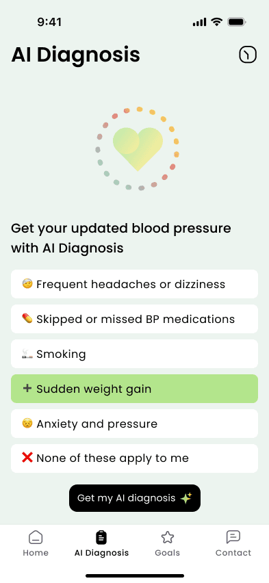
Select Symptoms to Start AI Diagnosis
Get Personalized Diagnosis from AI
View and Share BP Diagnosis Report

Use AI Diagnosis
Patients can receive personalized health insights and actionable suggestions powered by AI, with the option to generate sharable BP reports for doctor visits.
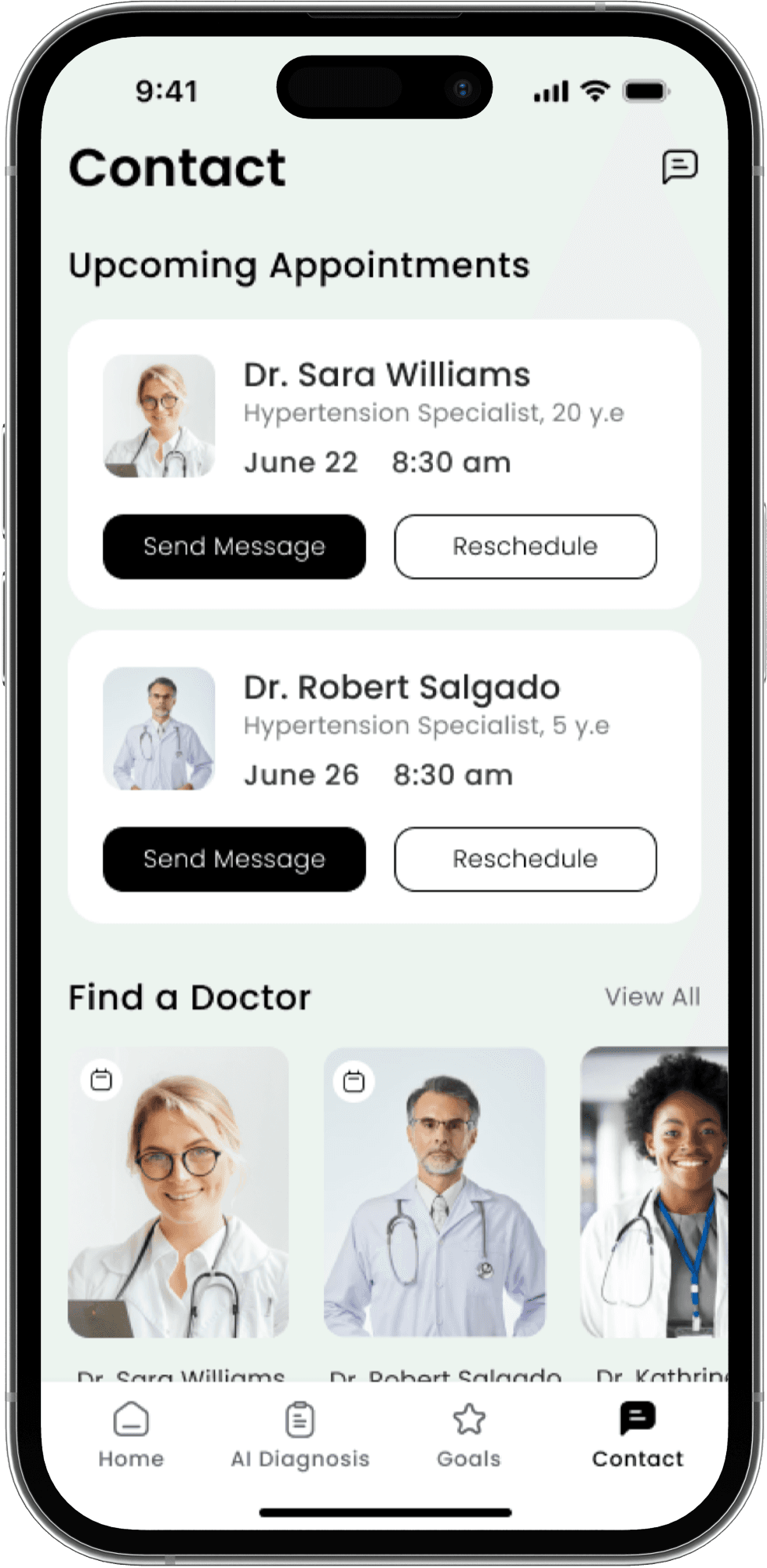
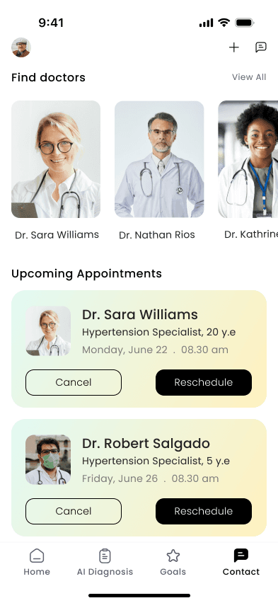
Manage Appointments & Browse Doctors
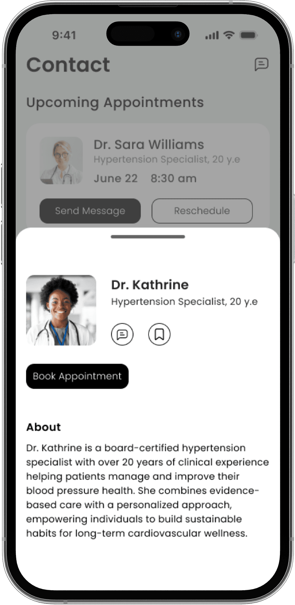
View Doctor Profile & Book Appointments

Chat with Doctors & Share AI Reports
Contact with Doctors
Easily message doctors, manage appointments, and share reports in one streamlined communication hub.
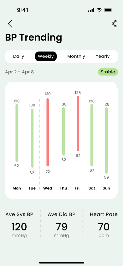
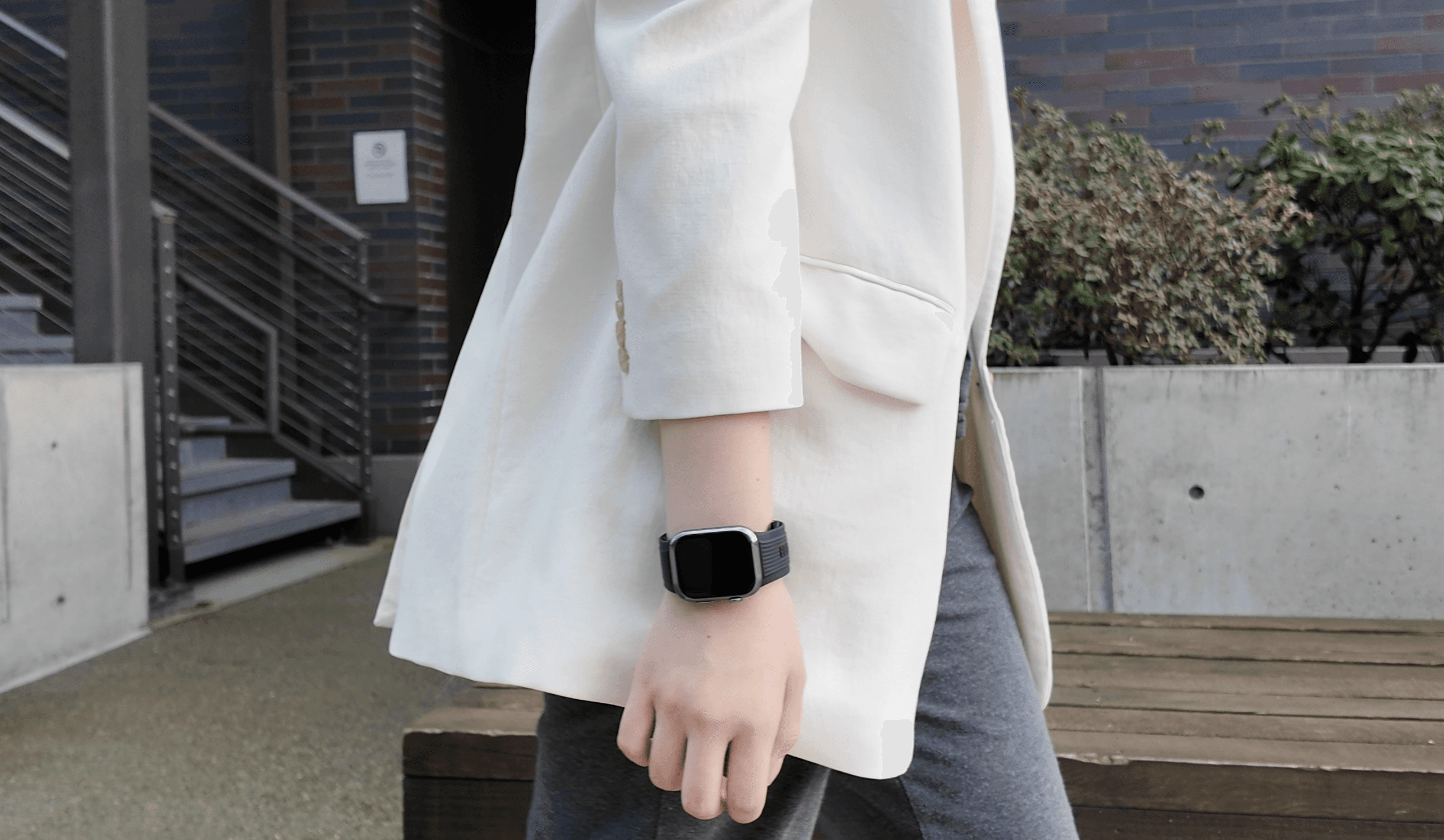
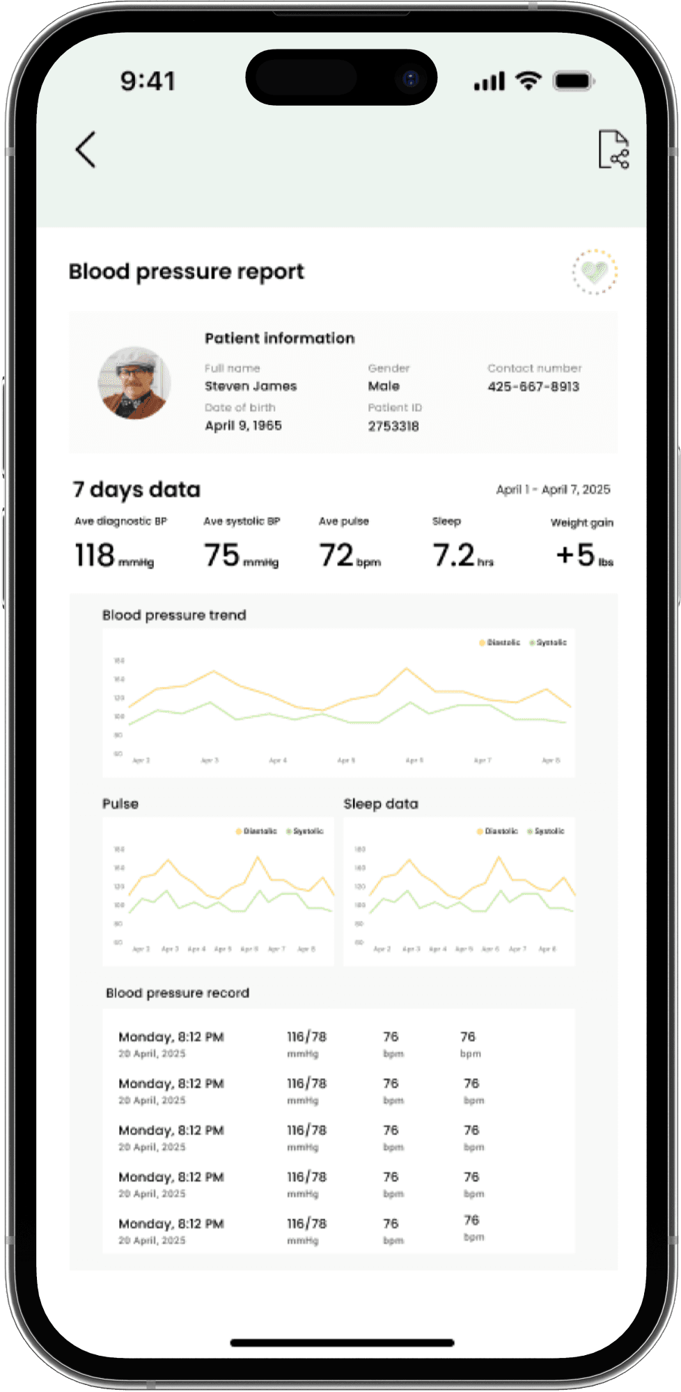
Monitor Blood Pressure & View Trending
Patients can track daily blood pressure automatically through wearable syncing, view status and trends with clear, color-coded visualizations.

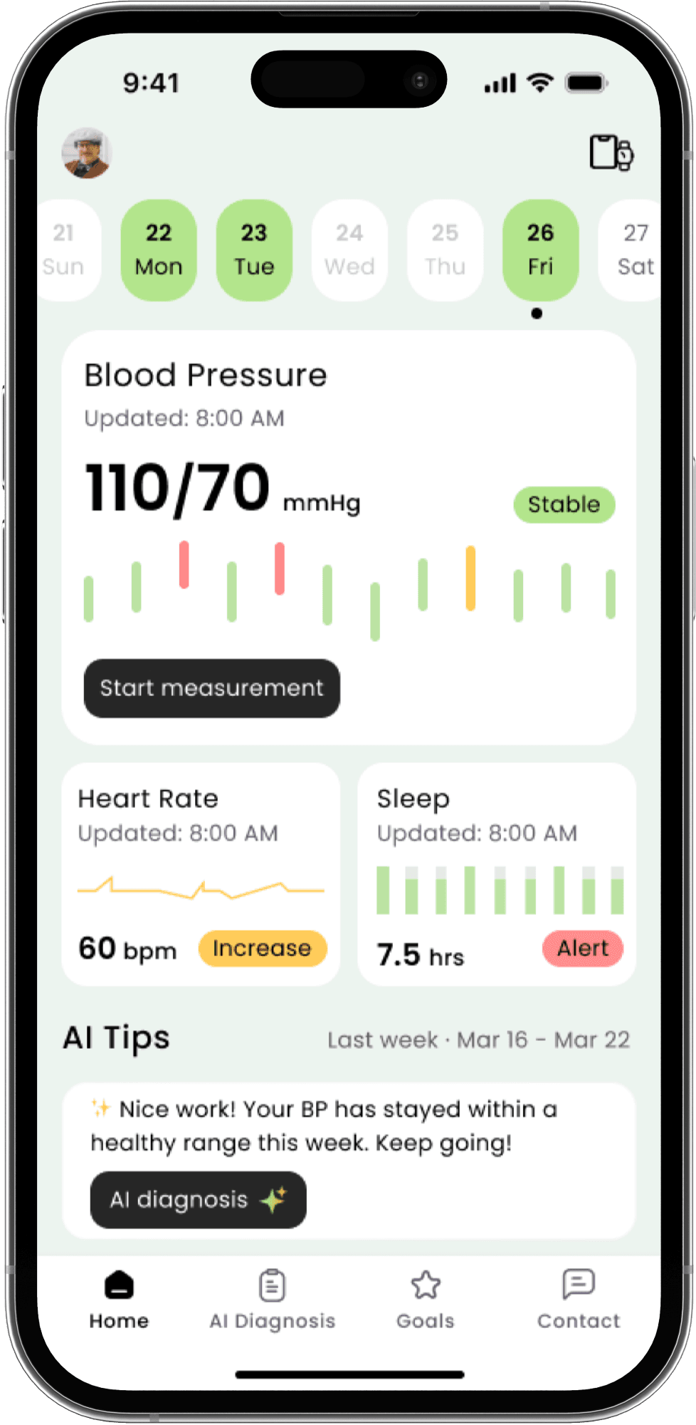
Visualize Blood Pressure Trends and status
Track Daily Blood Pressure
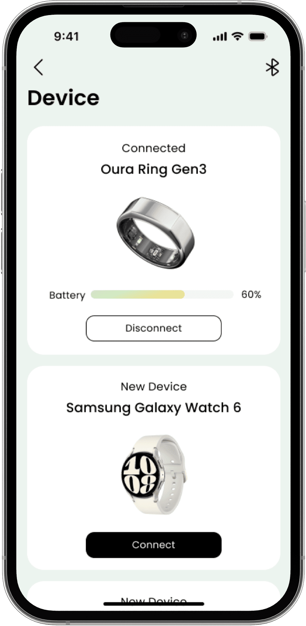
Connect and Sync Health Devices
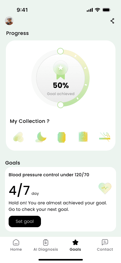
Manage Hypertension with Goal Motivation
Motivate patients to stay engaged through customizable health goals, progress tracking, and collectible achievements medals that reward healthy habits.
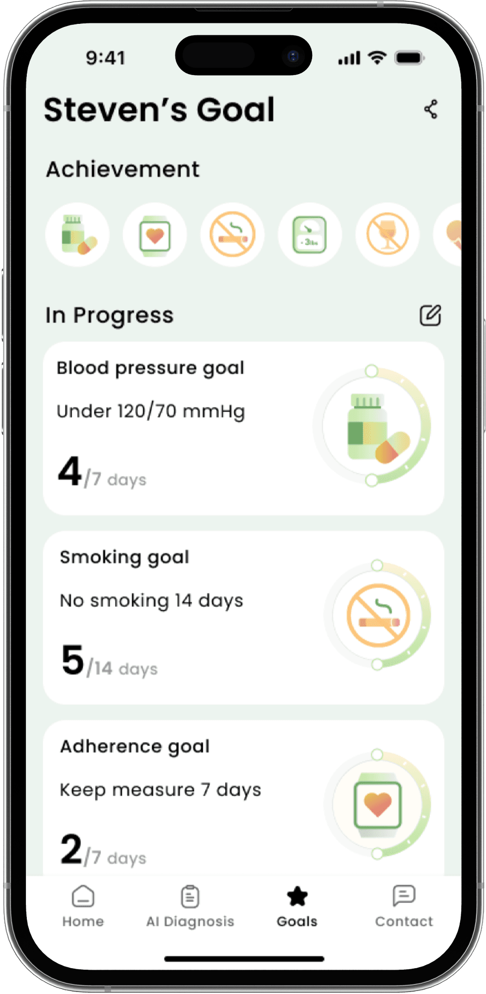

Track Progress on Blood Pressure Control Goals
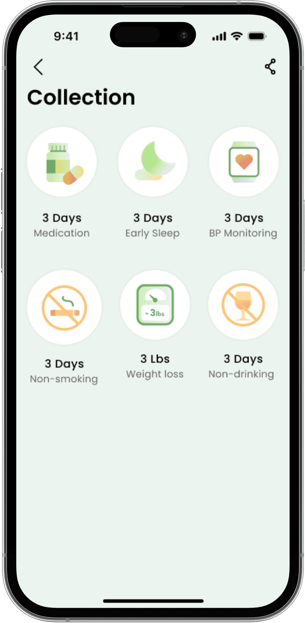
Collect Achievements and Stay Motivated
Customize Blood Pressure Goal